阅读KotlinCompose从入门到实战读书笔记一

1.Compose基本概念
相较于之前基于view体系的UI,Compose是Android全新的声明式UI,那么声明式和命令式的区别是什么?
基于View体现的UI就是典型的命令式UI,我们需要一步步的告诉程序怎么取执行,我们需要获取控件,然后给控件设置对应的属性,而控件会持有相应的属性值,相当于控件是持有状态的。但是声明式UI是我们告诉程序我想要怎么样,剩下的由程序处理。
2.设置项目支持Compose
build.gradle的相关配置
android{
    ...
    //compose是基于单一语言(Kotlin)的
    kotlinOptions {
        jvmTarget = '1.8'
    }
    buildFeatures {
        compose true
    }
    composeOptions {
        kotlinCompilerExtensionVersion '1.2.0'
    }
    packagingOptions {
        resources {
            excludes += '/META-INF/{AL2.0,LGPL2.1}'
        }
    }
}
dependencies{
    ...
    //ComponentActivity
    implementation 'androidx.activity:activity-compose:1.4.0'
    //compose的基础库
    implementation "androidx.compose.ui:ui:$compose_ui_version"
    //用于compose的预览
    implementation "androidx.compose.ui:ui-tooling-preview:$compose_ui_version"
    //Material的compose
    implementation 'androidx.compose.material:material:1.2.0'
    //compose版本的constraintlayout
    implementation "androidx.constraintlayout:constraintlayout-compose:1.0.1"
    //一个图片加载框架
    implementation "io.coil-kt:coil-compose:2.2.2"
    //compose版本的livedata
    implementation "androidx.compose.runtime:runtime-livedata:$compose_ui_version"
}
如果是通过AS来直接生成一个Compose项目的话,上面部分配置和依赖都会已经添加好,不过我们也可以自行配置嘛,Compose是支持和原生项目混编的,支持在Compose中使用原生View体系,也支持在原生的View体系中使用Compose。
来看一下通过AS直接创建一个空的Compose项目的MainActivity
//继承的是ComponentActivity
class MainActivity : ComponentActivity() {
override fun onCreate(savedInstanceState: Bundle?) {
super.onCreate(savedInstanceState)
//设置了个沉浸,非必须
WindowCompat.setDecorFitsSystemWindows(window, false)
val controller = WindowCompat.getInsetsController(window, window.decorView)
controller.isAppearanceLightStatusBars = true
//设置内容
setContent {
//在ui/theme/下Theme.kt中配置的主体
StComposeTheme {
//具体的控件后面再说,这里可以理解为全屏,背景色为StComposeTheme中配置的background的color
Surface(
modifier = Modifier.fillMaxSize(),
color = MaterialTheme.colors.background
) {
Greeting("Android")
}
}
}
}
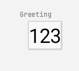
/**
声明的一个Compose函数,@Preview可以预览当前Compose的样式,不过需要注意有参数的话记得给出默认值
*/
@Preview(showBackground = true)
@Composable
fun Greeting(str:String = "123"){
//就一个文本控件
Text(text = str)
}
}
Compose函数预览效果
不过现在Greeting函数非常简单,下面我们来构建一个复杂的页面:
先看预览的效果图:
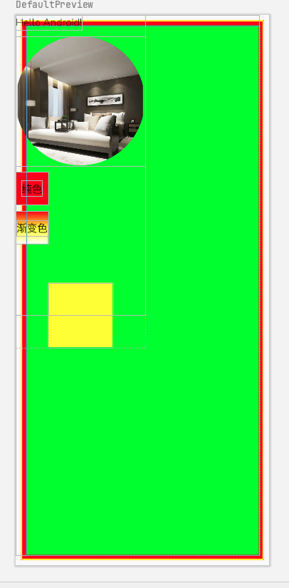
@Composable
fun Greeting(name: String) {
    Box(
        modifier = Modifier
            .fillMaxSize()
            //compose中只有padding的概念,根据调用的顺序可以实现原来的外边距和内边距的效果
            //这里设置的就是外边距
            .padding(8.dp)
            //设置边框 宽2dp 黄色 圆角为2dp
            .border(2.dp, Color.Yellow, shape = RoundedCornerShape(2.dp))
            .background(color = Color.Red)
            .padding(8.dp)
    ) {
        Spacer(
            //注意这里的Modifier,因为它是在BoxScope的中,所以它可以设置的方法会多出两个分别是align和matchParenSize,这是在Box中的Modifier中不具备的
            modifier = Modifier
                .matchParentSize()
                .background(color = Color.Green)
        )
    }
    //定义个列表
    Column {
        //文本控件
        Text(text = "Hello $name!")
        //因为Compose中没有Margin的概念,不过可以通过Spacer来设置两个控件之间的间距
        Spacer(modifier = Modifier.height(10.dp))
        //图片控件
        Image(
            //使用本地图片资源的方式
            painter = painterResource(id = R.mipmap.ic_hotel_share_img),
            //描述信息,可以为空
            contentDescription = null,
            //设置图片的宽高以及裁剪样式为圆形
            modifier = Modifier
                .size(width = 200.dp, height = 200.dp)
                .clip(CircleShape)
        )
        Spacer(modifier = Modifier.height(10.dp))
        Box(
            modifier = Modifier
                .size(50.dp)
                .background(color = Color.Red)
        ) {
            Text(text = "纯色", Modifier.align(Alignment.Center))
        }
        Spacer(modifier = Modifier.height(10.dp))
        Box(
            modifier = Modifier
                .size(50.dp)
                .background(
                    //背景的渐变效果
                    brush = verticalGradientBrush1
                )
        ) {
            Text(text = "渐变色", Modifier.align(Alignment.Center))
        }
        Spacer(modifier = Modifier.height(10.dp))
        Box(
            modifier = Modifier
                .size(100.dp)
                //设置偏移量
                //.offset(50.dp, 50.dp)
                //offset的重载方法
                .offset { IntOffset(50.dp.roundToPx(), 50.dp.roundToPx()) }
                .background(color = Color.Yellow)
        )
    }
}

//两种创建渐变色的方式
//方式一给定颜色列表,颜色均匀分布
val verticalGradientBrush1 = Brush.verticalGradient(
    colors = listOf(Color.Red, Color.Yellow, Color.White)
)
//给定偏移量和颜色
val verticalGradientBrush2 = Brush.verticalGradient(
    //0-0.1显示红色
    0.1f to Color.Red,
    //0.1-0.3显示红到绿色的渐变
    0.3f to Color.Green,
    //0.3-0.9显示绿色到蓝色的渐变
    0.9f to Color.Blue
)
3.关于Scopse的举例说明
在Compose所提供的控件都是有一个content参数,这就是每个的作用域
@Composable
inline fun Box(
    modifier: Modifier = Modifier,
    contentAlignment: Alignment = Alignment.TopStart,
    propagateMinConstraints: Boolean = false,
    content: @Composable BoxScope.() -> Unit
) {
    val measurePolicy = rememberBoxMeasurePolicy(contentAlignment, propagateMinConstraints)
    Layout(
        content = { BoxScopeInstance.content() },
        measurePolicy = measurePolicy,
        modifier = modifier
    )
}
在之前的View体系中,例如在xml布局中我们可以给一个子view设置android:layout_toRight属性,哪怕它的外层布局是Linerlayout布局,这个属性并不会生效。
而在Compose中通过Scope限制对应属性能够生效的范围,下面是BoxScope的代码,通过@LayoutScopeMarker元注解,除了是Modifier的公共属性外,那么在特定Scope中定义的方法,只能在对应的作用域来调用。就像下面的BoxScope,它内部定义有两个方法align和matchParentSize,那么这两个方法只能在BoxScope作用域内调用。
@LayoutScopeMarker
@Immutable
interface BoxScope {
    /**
     * Pull the content element to a specific [Alignment] within the [Box]. This alignment will
     * have priority over the [Box]'s `alignment` parameter.
     */
    @Stable
    fun Modifier.align(alignment: Alignment): Modifier

    /**
     * Size the element to match the size of the [Box] after all other content elements have
     * been measured.
     *
     * The element using this modifier does not take part in defining the size of the [Box].
     * Instead, it matches the size of the [Box] after all other children (not using
     * matchParentSize() modifier) have been measured to obtain the [Box]'s size.
     * In contrast, a general-purpose [Modifier.fillMaxSize] modifier, which makes an element
     * occupy all available space, will take part in defining the size of the [Box]. Consequently,
     * using it for an element inside a [Box] will make the [Box] itself always fill the
     * available space.
     */
    @Stable
    fun Modifier.matchParentSize(): Modifier
}